Designing a clearer procurement experience for construction value engineering.
VE+ is an early-stage construction-tech startup focused on value engineering for finishes, fixtures, and procurement packages.
The challenge was not only designing a website - it was translating a technically complex and partially manual service into a clear, trustworthy, and scalable digital experience. I led the project end-to-end: UX strategy, information architecture, UI design, visual system, product visualisations, copywriting, WordPress development, and responsive implementation.
How do you design trust around a system that is still being built?
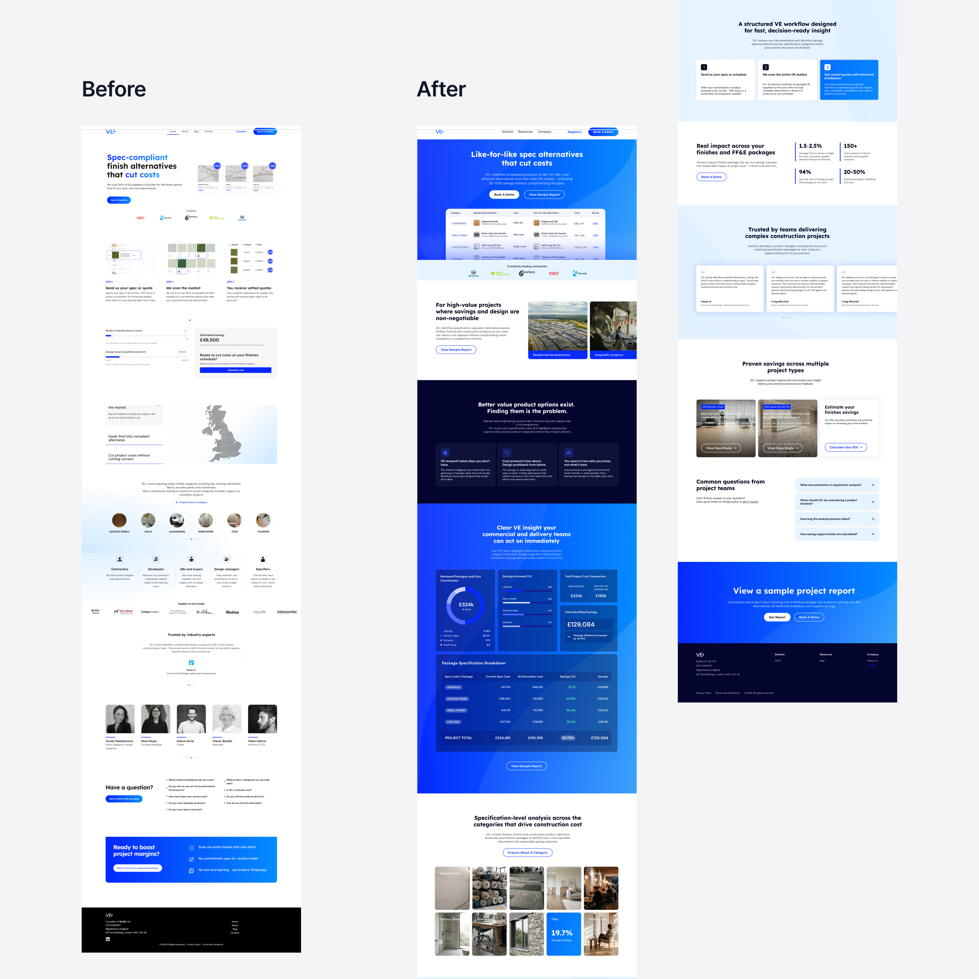
VE+ operates in an industry where trust, clarity, and credibility are critical. The original site was built quickly during the startup’s early stage and suffered from unclear messaging, a weak UX hierarchy, abstract service explanation, and a high-friction conversion flow.
The product itself also presented unique challenges: much of the workflow was still manual, no real dashboards existed, supplier databases were incomplete, and there was little social proof or case study material.
How do you design trust around a complex procurement system that is still being built?
Four friction points, surfaced through a UX and messaging audit.
- 01
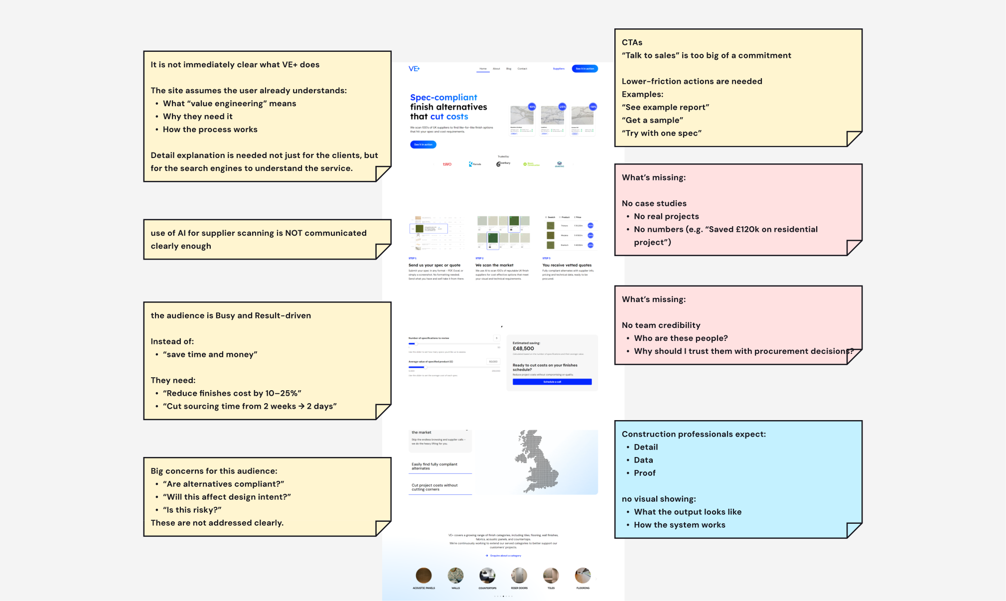
The service was too abstract.
The site assumed users already understood value engineering. Construction professionals are results-driven and needed clearer, more outcome-focused communication.
- 02
The value proposition lacked clarity.
Vague statements like ‘save time and money’ replaced with measurable savings, clear turnaround times, and practical procurement outcomes.
- 03
The service lacked tangibility.
No real dashboards, no visible workflows, no platform UI, no proof of output. The redesign needed to visually simulate the future system.
- 04
The conversion flow created friction.
Users were pushed too quickly toward high-commitment CTAs like ‘Talk to sales.’ Lower-friction actions were missing view sample reports, upload a specification.
Competitive analysis, narrative-driven UX.
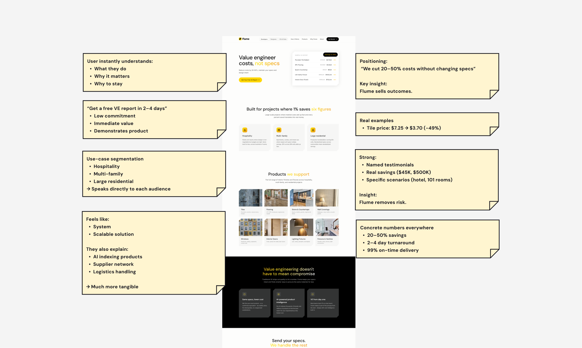
I analysed competitor platforms and SaaS products to understand how similar services communicated complex workflows. One of the most influential references was Flume, whose platform focused on outcome-driven messaging, visible ROI, productised onboarding, and tangible system outputs.
Insights:
- users respond better to outcomes than features
- proof reduces perceived risk
- technical services need visual explanation
- procurement professionals expect structure, detail, credibility
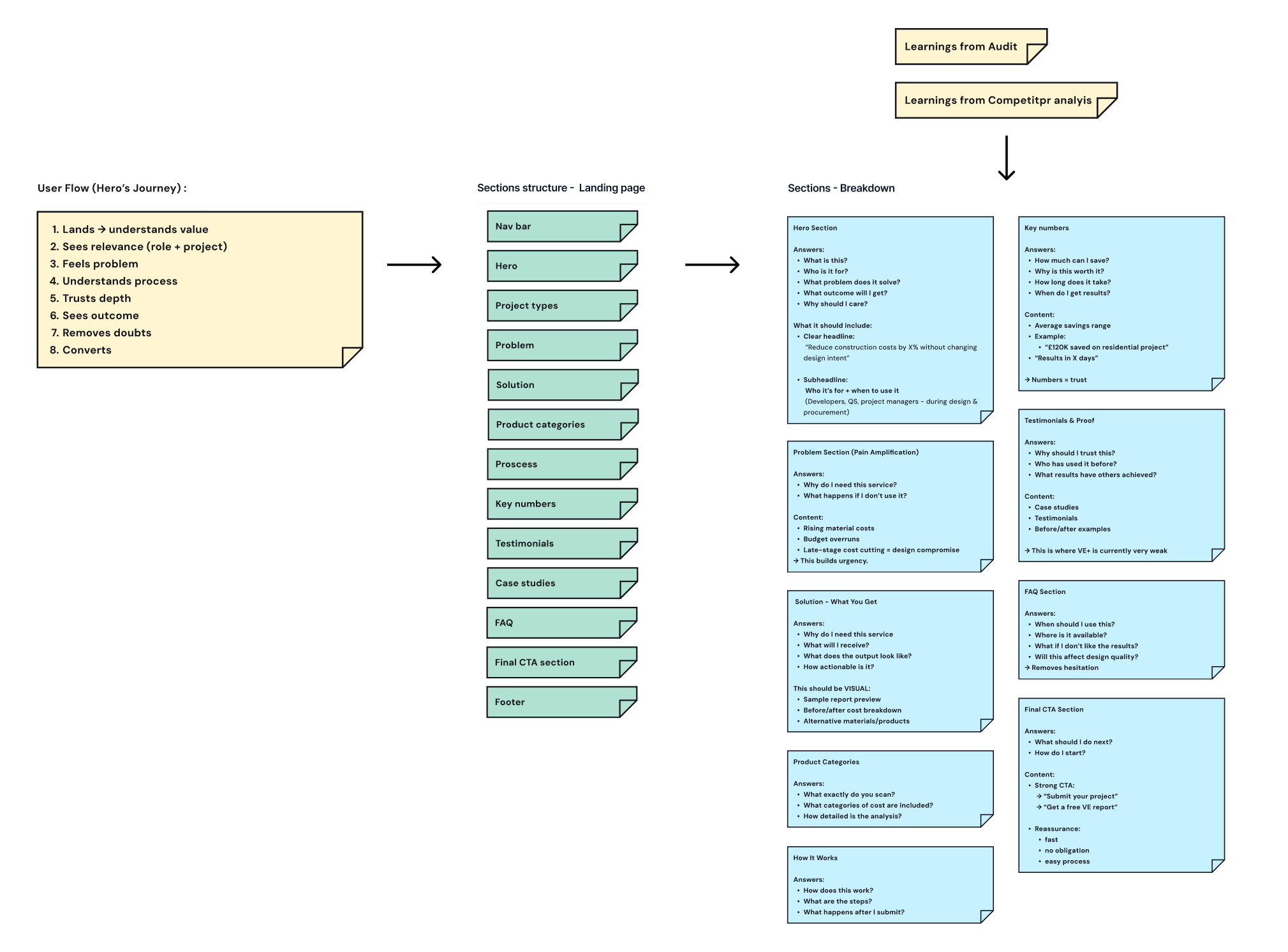
The redesign was heavily influenced by narrative-based UX principles and the Hero’s Journey. Instead of treating the brand as the hero, the website positioned the user as the central figure contractors trying to protect margins, developers reducing cost risk, QSs sourcing compliant alternatives. The platform became the guide helping them navigate a difficult procurement process.
A narrative flow, not a feature list.
- 01
Understand the value proposition
Hero section sets up what VE+ does, instantly.
- 02
Recognise the pain points
Problem amplification grounds the service in the reader’s reality.
- 03
See measurable outcomes
Savings visualisation makes ROI concrete.
- 04
Understand the process
Process explanation turns invisible workflow into something legible.
- 05
See proof and credibility
Product categories, testimonials, ROI sections.
- 06
Explore examples
FAQs and worked examples reduce remaining hesitation.
- 07
Convert with lower perceived risk
Multiple low-friction CTAs replace the single ‘Talk to sales.’
Make a partly-manual service feel enterprise-ready.
The redesign aimed to make VE+ feel data-driven, scalable, systemised, and enterprise-ready - even though much of the backend workflow was still evolving. The visual system drew from modern SaaS, enterprise dashboards, procurement software, and technical data visualisation.
“This is a reliable system, not just a consultancy service.”
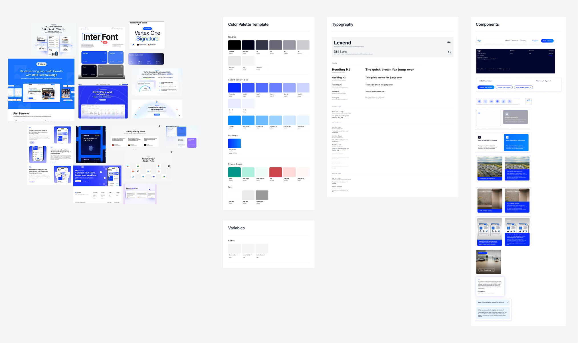
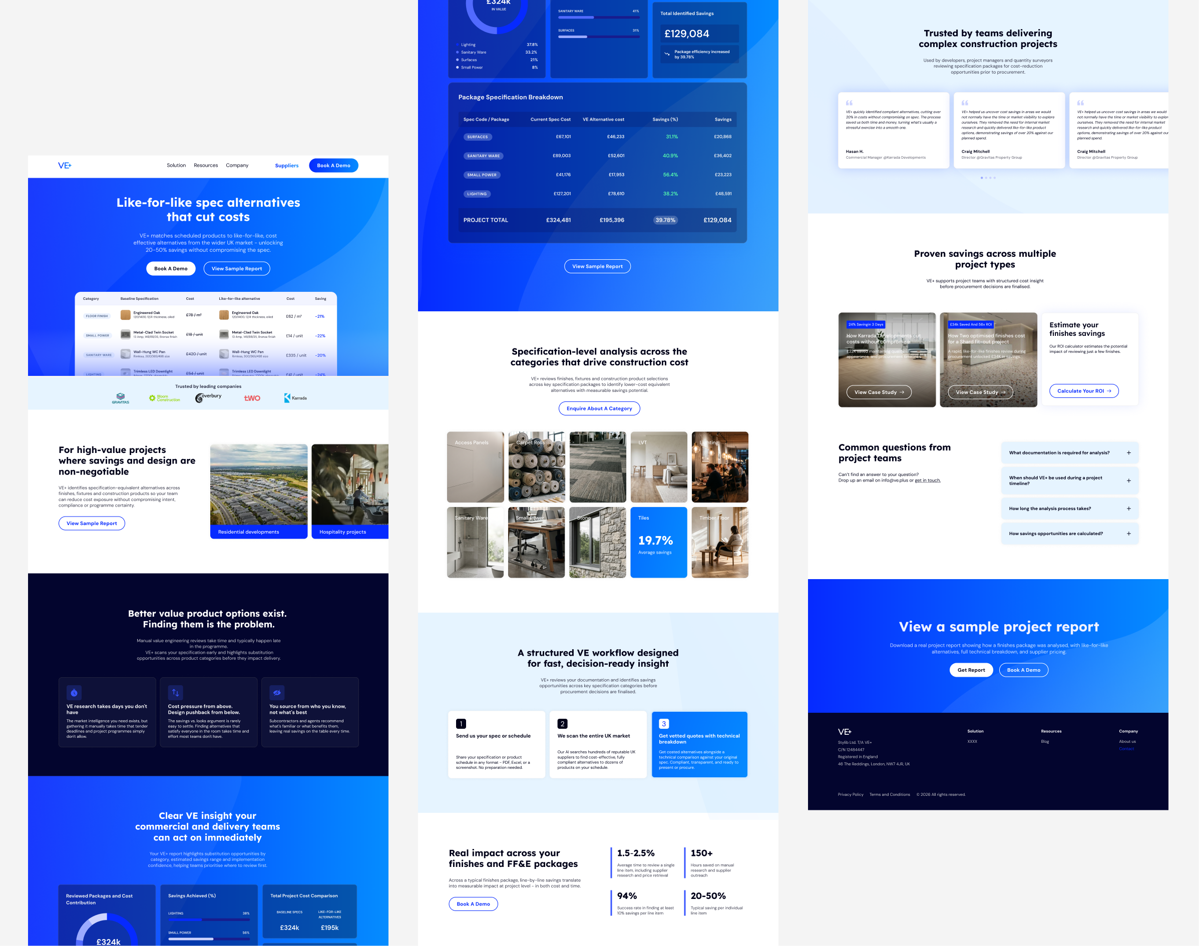
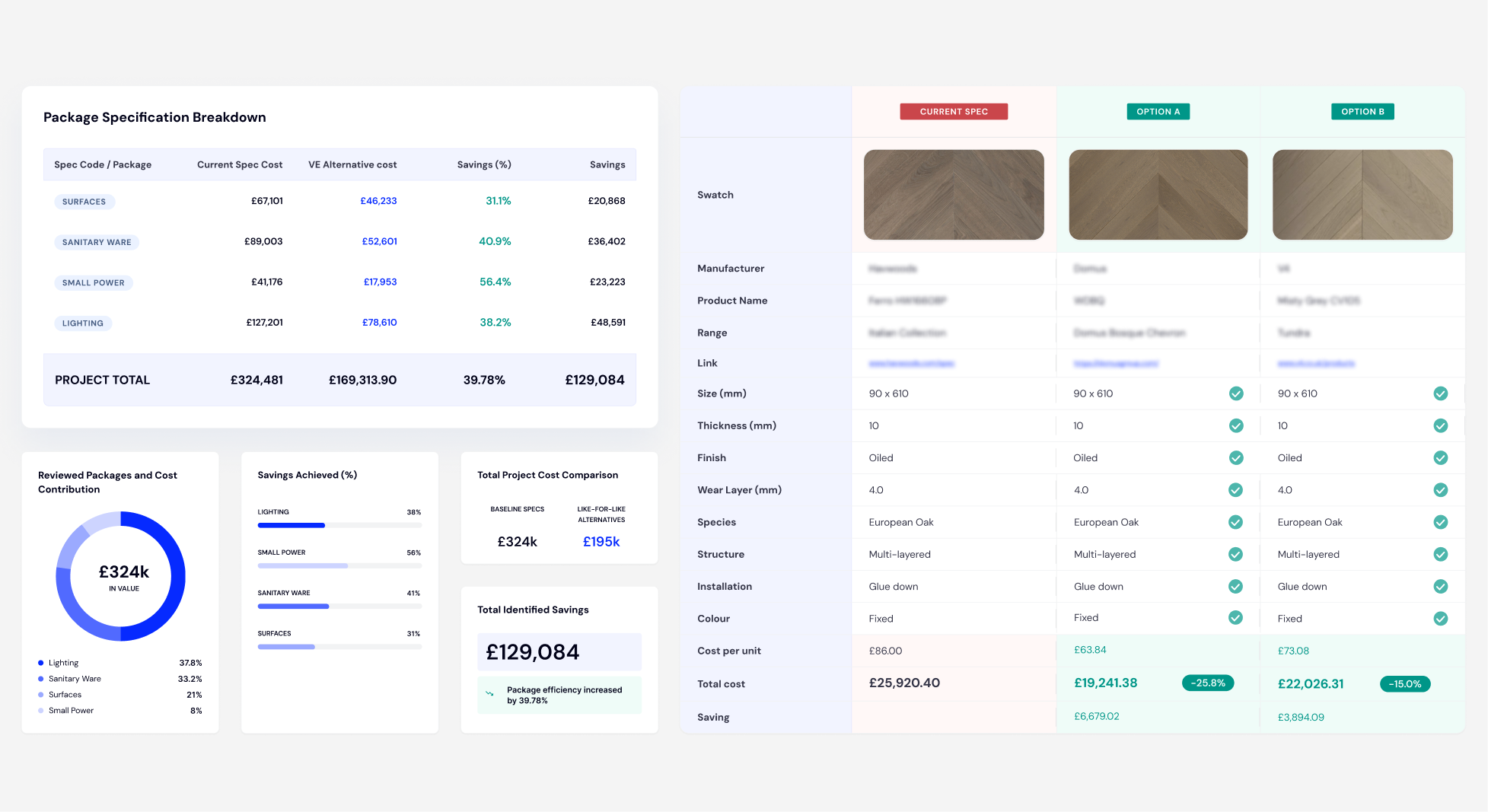
Dashboards as communication tools.
A major challenge was the absence of real platform interfaces. To solve this, I designed conceptual dashboards and data visualisations that represented savings reports, specification comparisons, procurement insights, supplier alternatives, and package breakdowns.
These interfaces were not fake product claims - they were communication tools designed to explain invisible workflows, reduce abstraction, visualise future platform capabilities, and build confidence in the service model. This became one of the strongest aspects of the project.
From vague startup service to structured procurement platform.
- Unclear messaging
- Weak UX hierarchy
- Abstract service explanation
- Limited trust signals
- High-friction conversion
- Clear, outcome-driven messaging
- Structured information architecture
- Tangible system visualisation
- Progressive trust building
- Multiple low-friction entry points
Designing under ambiguity.
This project taught me how to design under ambiguity. The biggest challenge wasn’t visual design it was creating clarity around a complex system that was still evolving operationally.
I learned how to:
- structure abstract workflows
- communicate unfinished systems honestly
- design trust before proof fully exists
- balance technical credibility with simplicity
- turn invisible operational processes into understandable experiences
It marked a major evolution in my own design thinking - from surface-level web execution to strategic UX and systems-oriented product thinking.